Process
I began the dashboard design process by interviewing infectious disease clinicians and epidemiologists about the characteristics of an infectious disease event. We identified the type of data that would answer emerging questions and the feasibility around gathering that data.
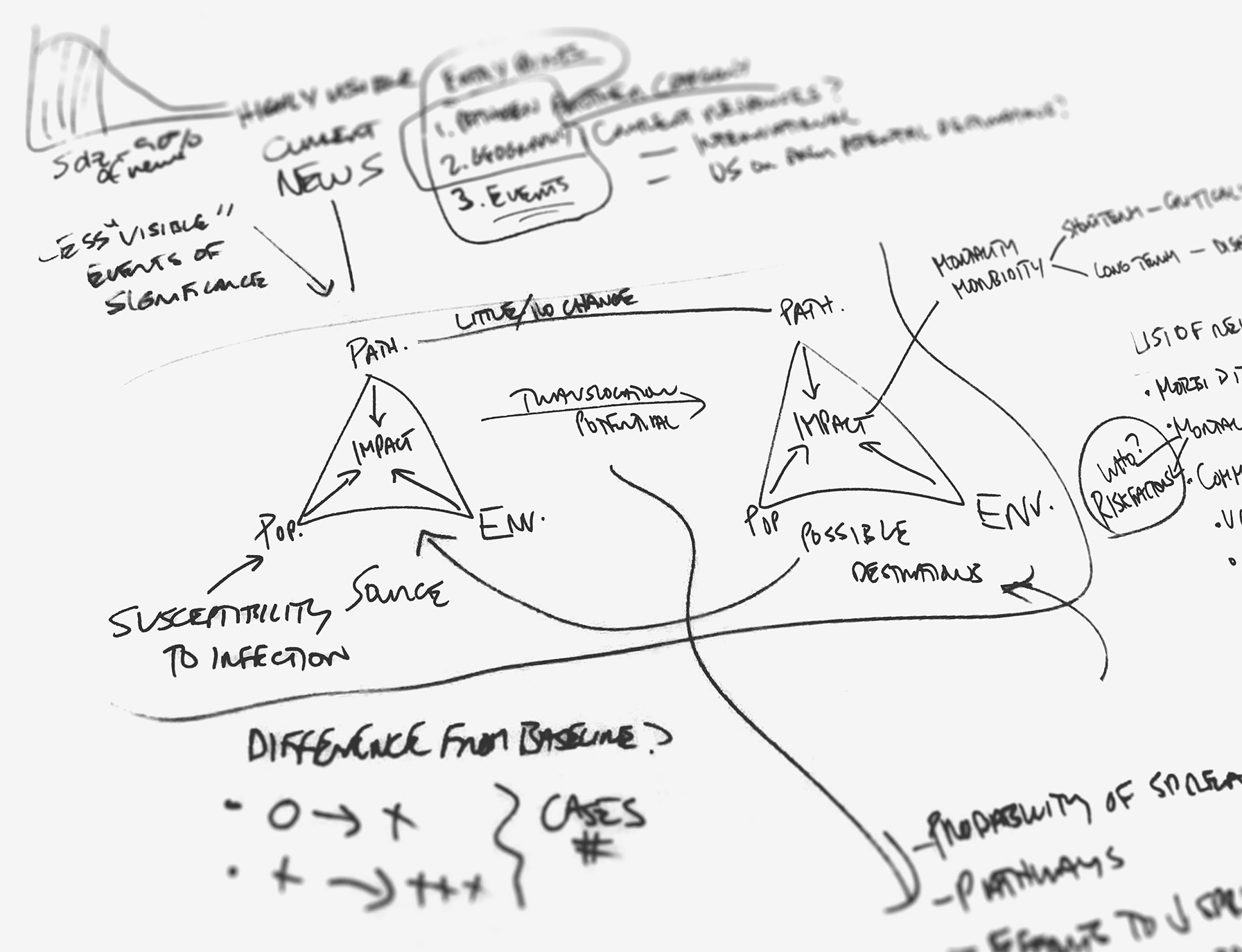
I took the dashboard through several quick iterations refining the information architecture and presentation to be in line with the stakeholders’ model of an emerging disease event. With each iteration, I identified important data to highlight and methods to best visualize that data. The following themes emerged:
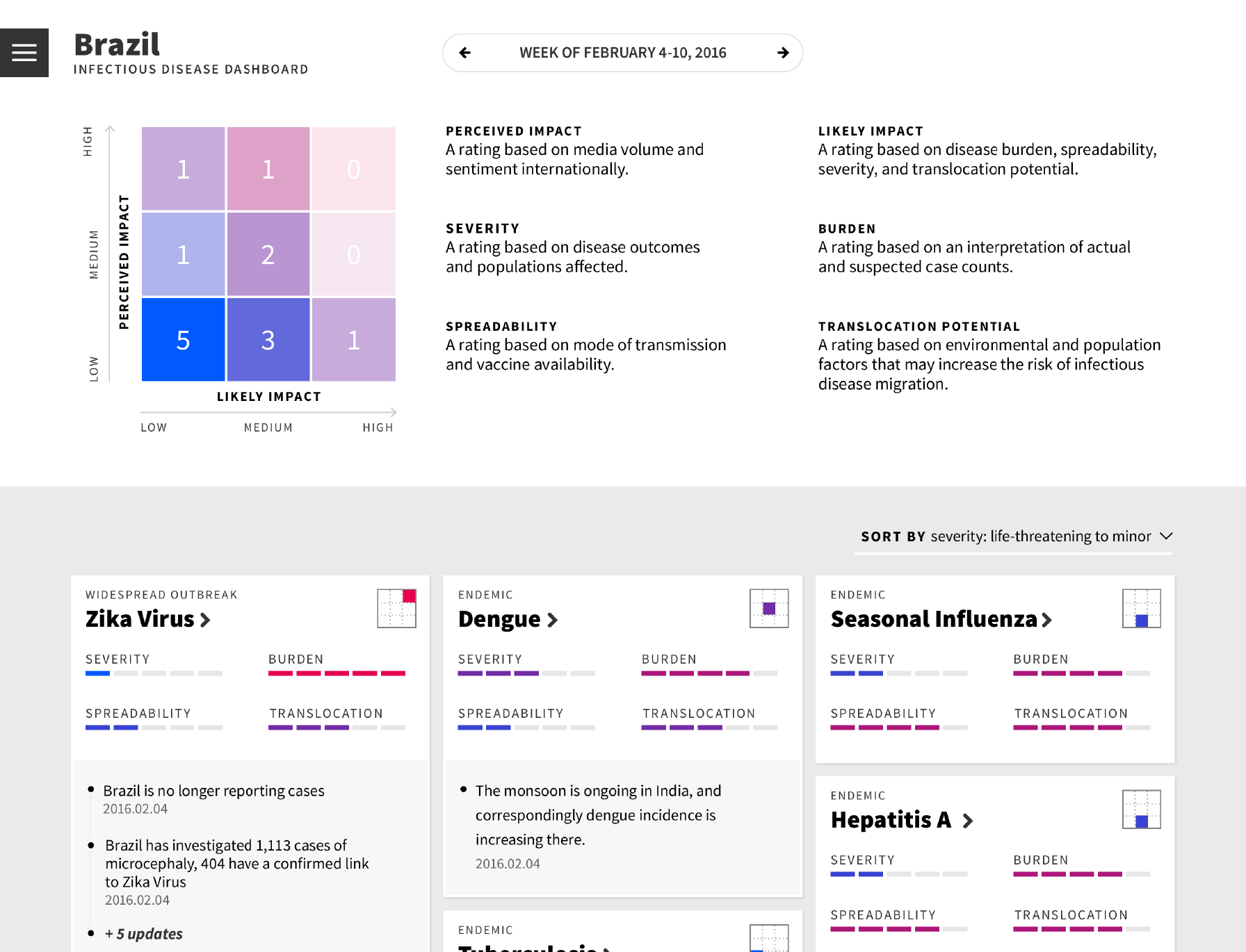
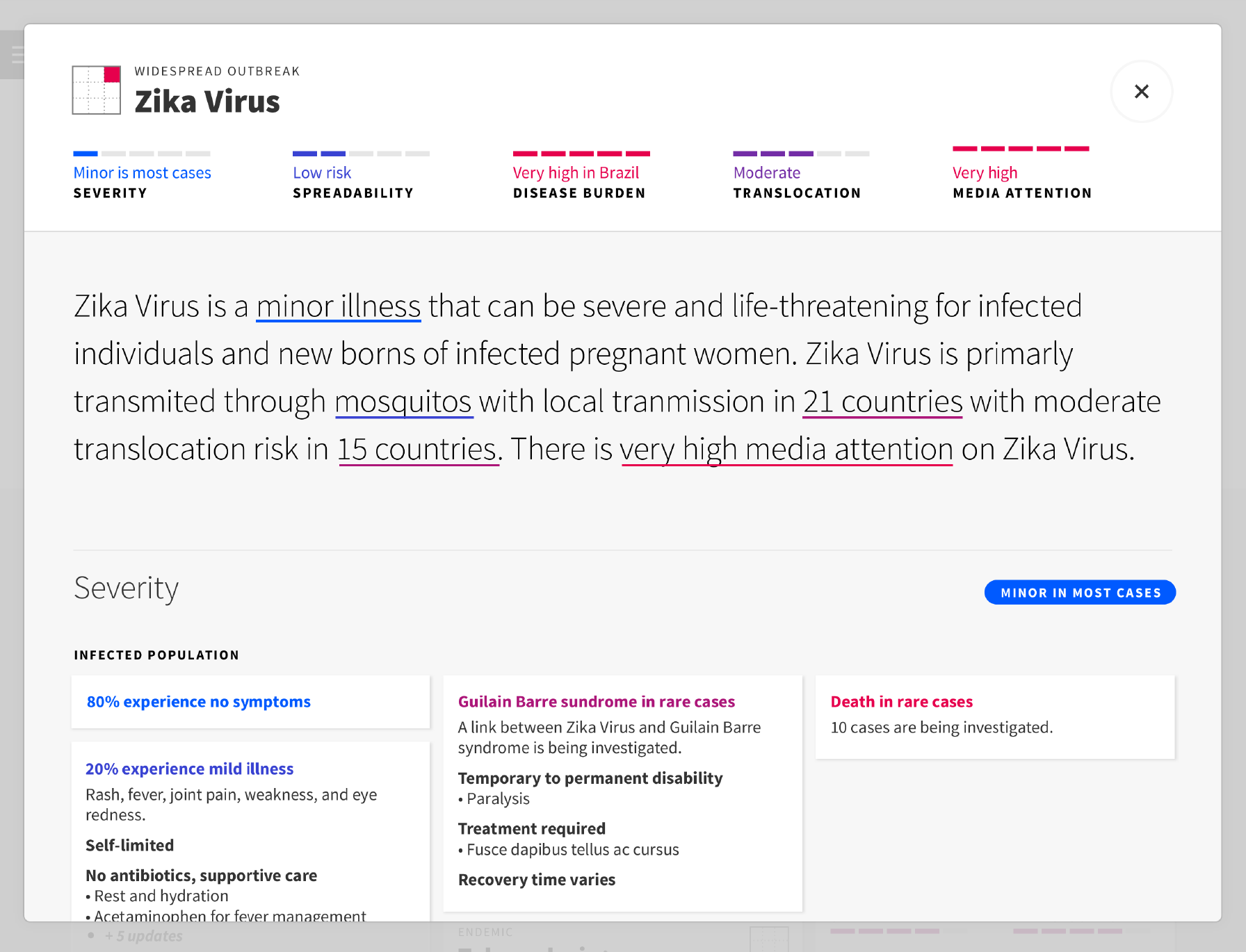
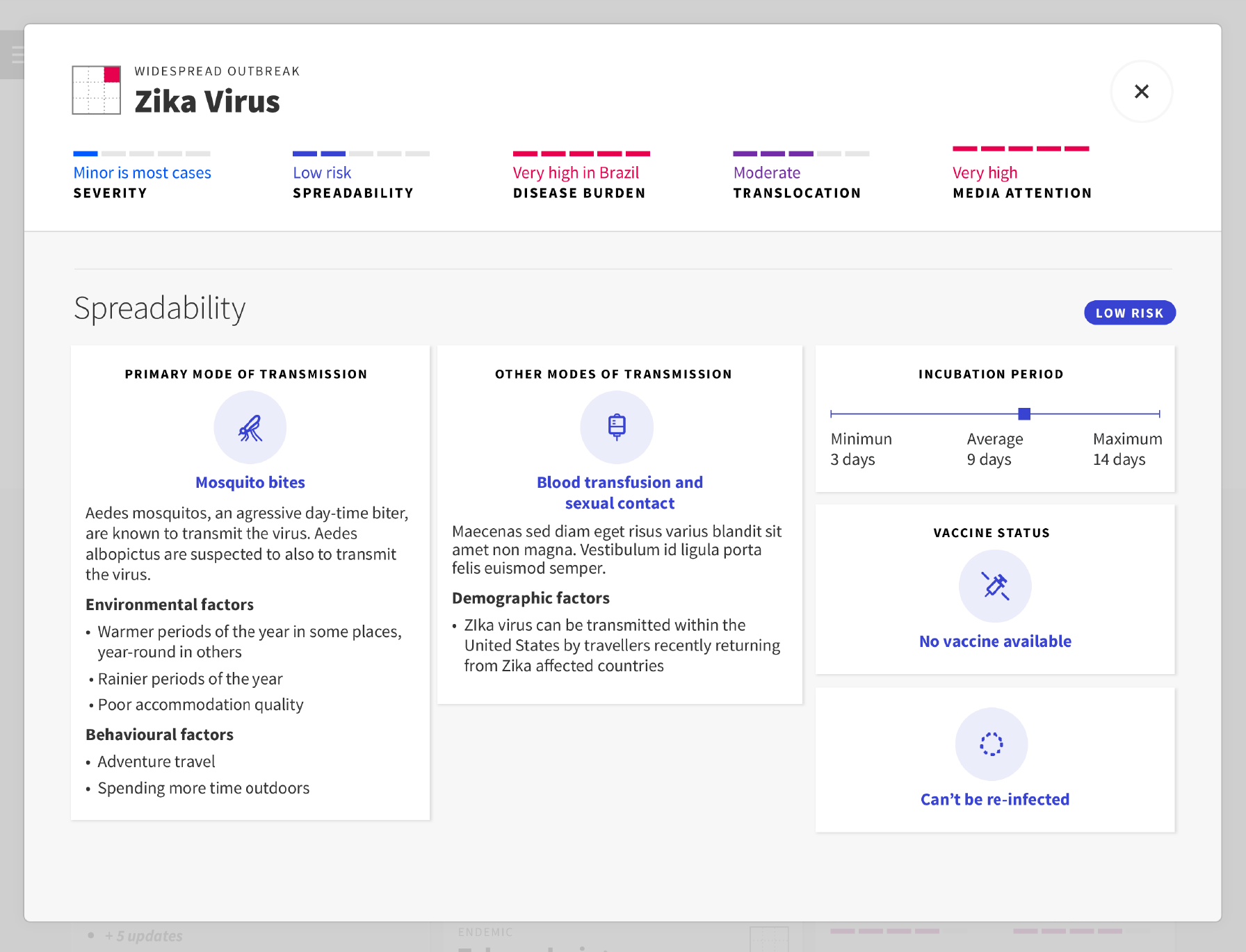
There's a disconnect between the perceived risk and the likely risk of emerging infectious disease events
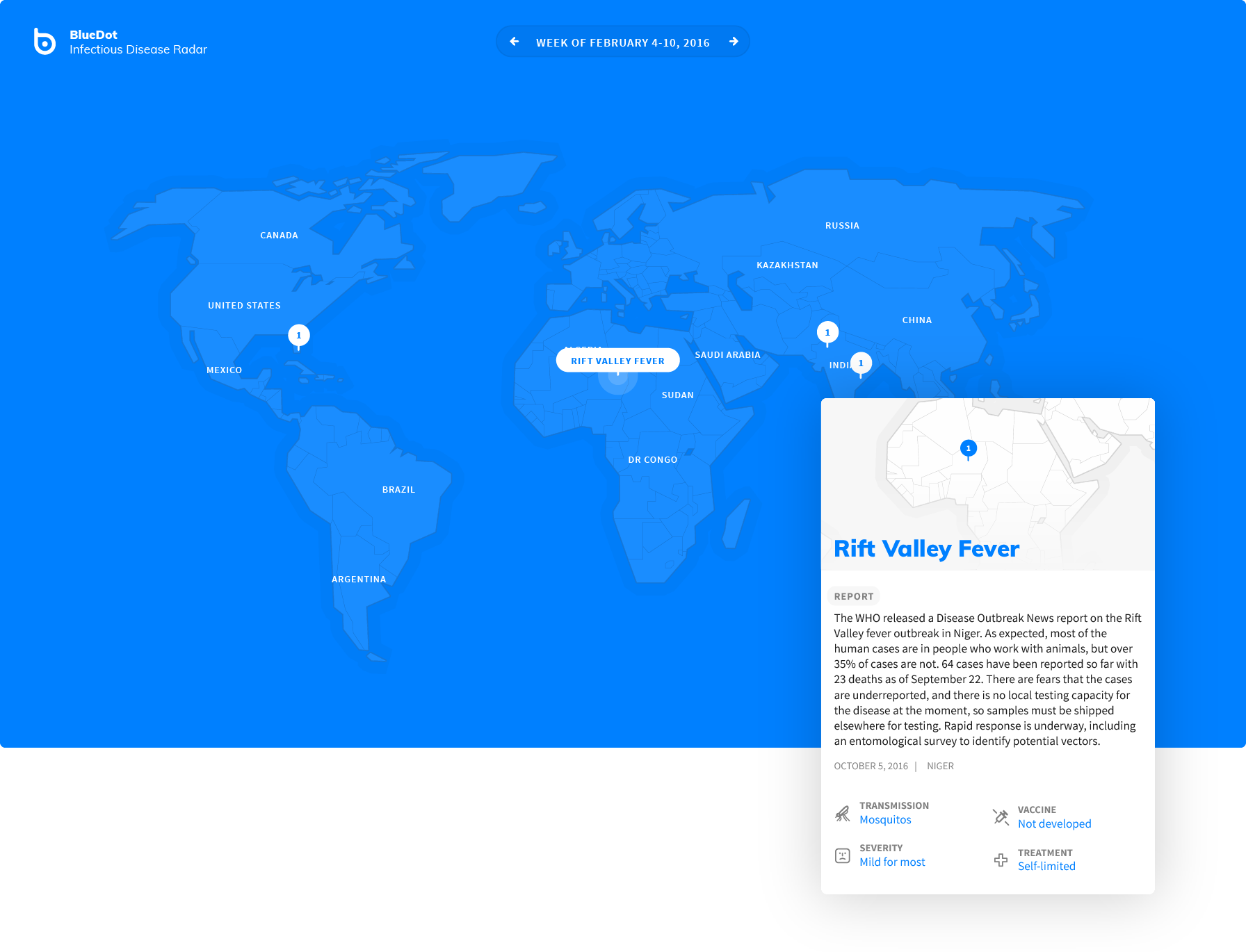
With outbreaks such as Zika virus epidemic in 2016 a lot of media hype is created and it's hard to discern what the actual risk and impact could be. What's the public sentiment about a disease event? Are there opportunities for new insurance plans? Bringing this information up to the surface will help insurance industry professionals quickly focus in on an event of concern.
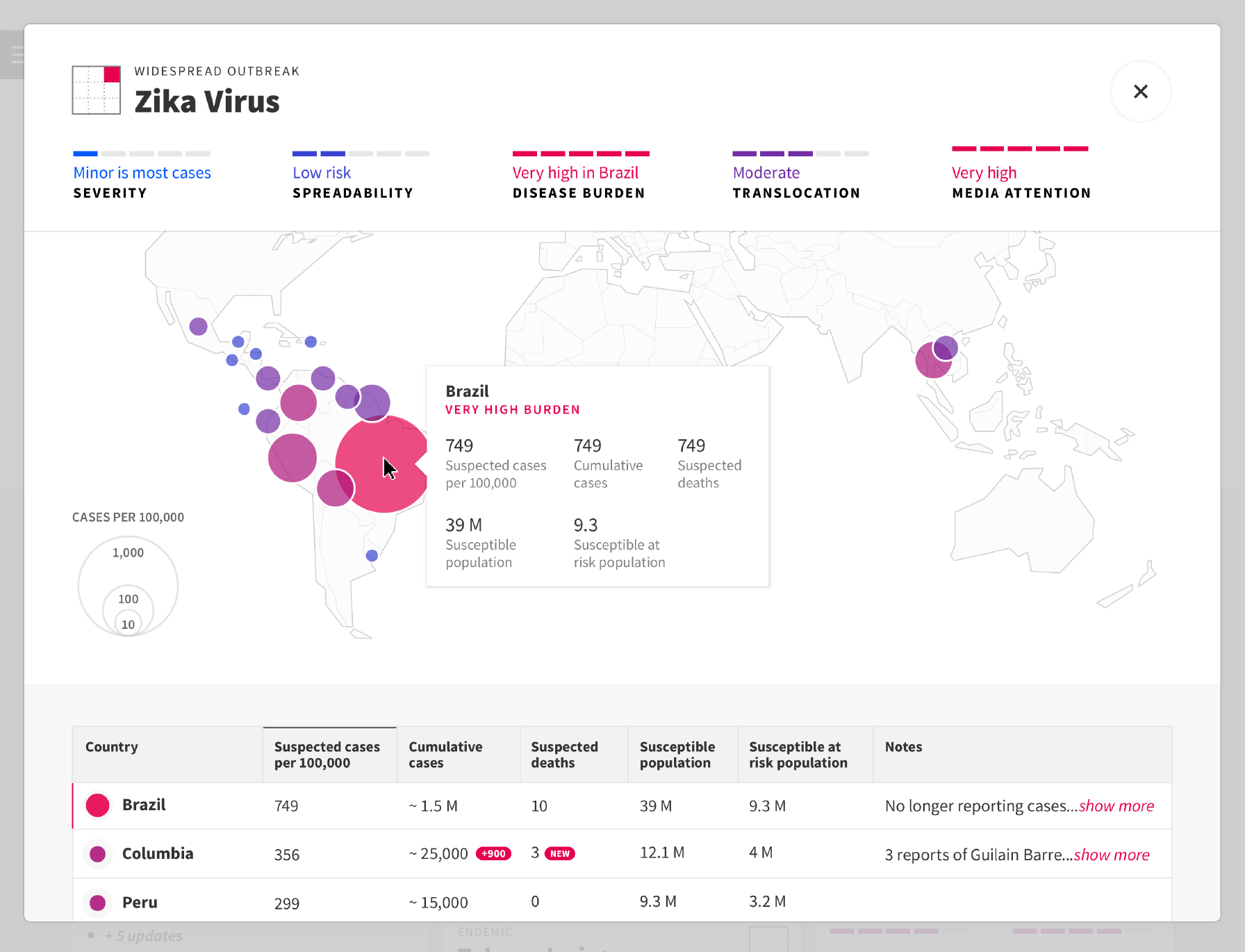
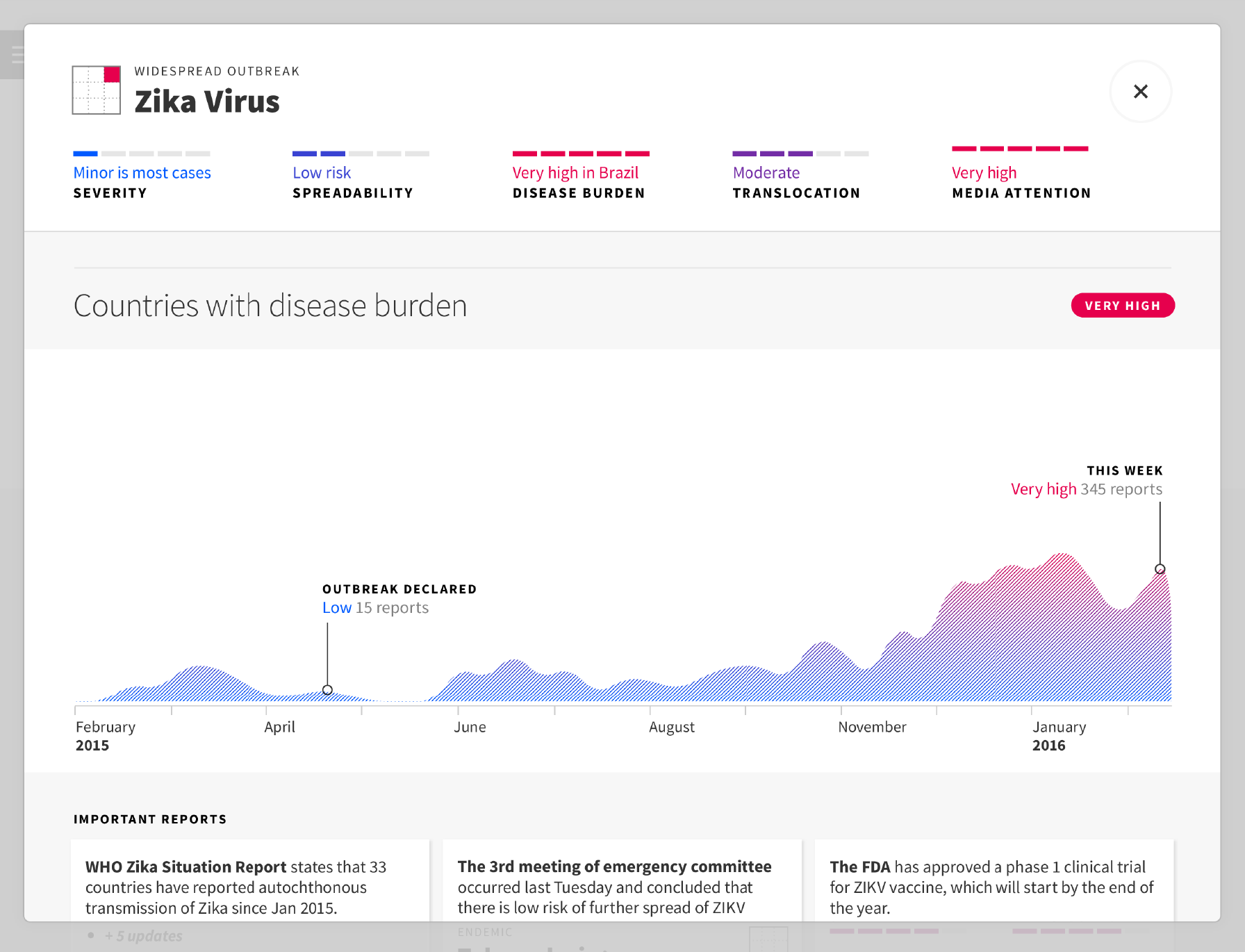
There's a lack of systematic and evidence-based data to answer important questions about the implications of an infectious disease event
Does a disease show an increase in cases compared to the baseline? Has a disease been shown to effect a new population group? It's not only important to show what's new but also how significant of a change it is.
There are many caveats to interpreting infectious disease data
Countries that lack sufficient healthcare infrastructure may not have the resources to accurate report emerging outbreaks. Mortality rates are often overestimated at the beginning of an outbreak. These are some of the things that require an expert's critical lens to decipher. In addition to presenting the hard facts, expert notes are key to helping a non-infectious disease expert understand the data.
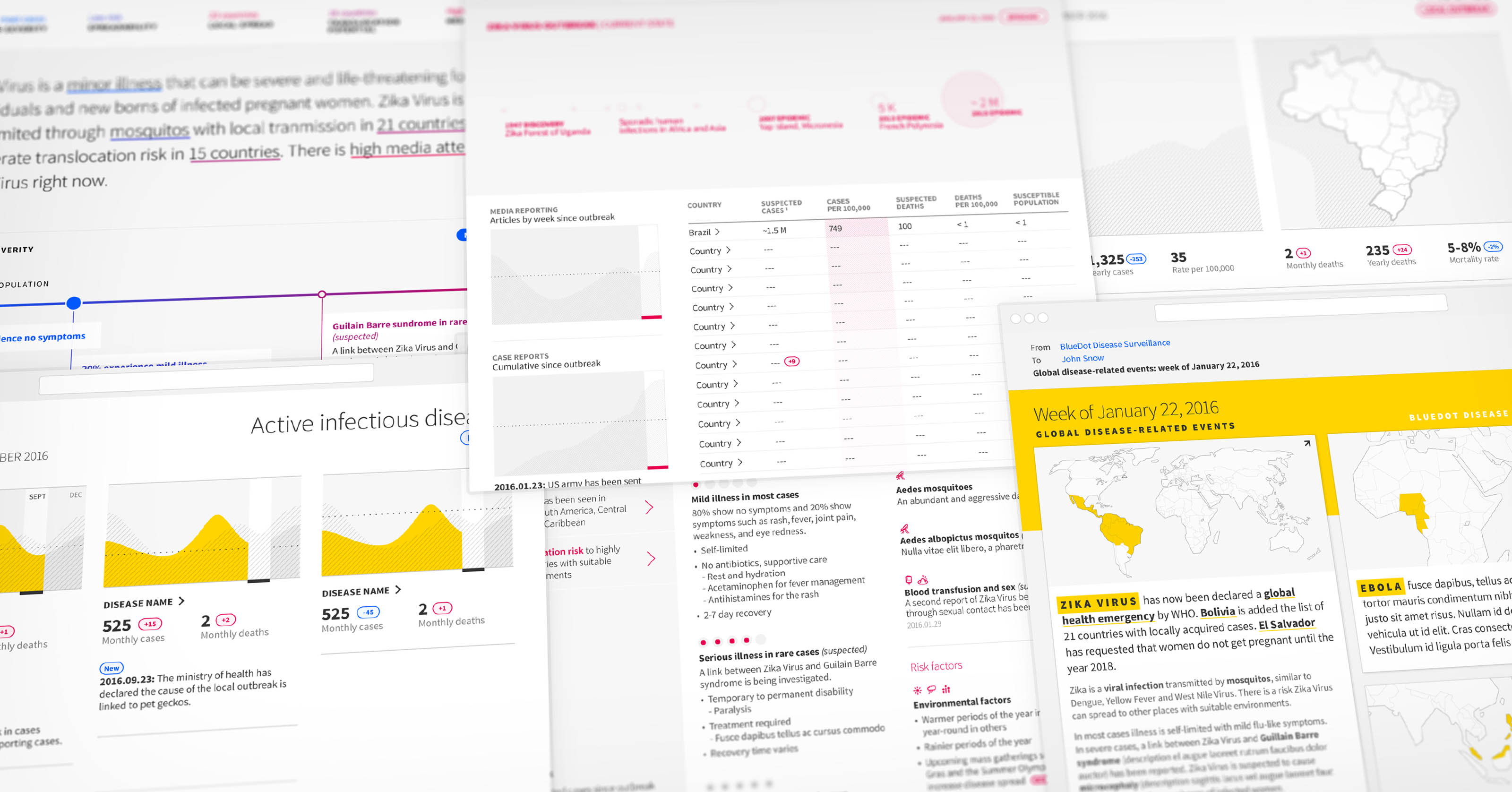
Concept Designs
Outcome
The original Infectious Disease Surveillance Dashboard use-case was broadened to better align with BlueDot’s product strategy. Working within the current data feasibility, I scaled down the design to be implemented as a proof of concept. This version was tested out internally with the BlueDot team and proved successful in contextualizing emerging infectious disease events during our weekly update meetings.